
In 2025, a strong online presence begins with mobile website optimization. As more than 62.45% of all global web traffic now comes from smartphones and tablets, compared to just 35.71% on desktops, businesses that fail to deliver a mobile-friendly website design risk falling behind their competitors. Today’s users expect speed, simplicity, and seamless browsing — and if your site doesn’t deliver, they’ll leave in seconds.
That’s where responsive web design comes in. By ensuring your website automatically adjusts to any screen size, you create a smooth, touch-friendly experience with faster loading times, clear navigation, and easier content readability. With Google’s mobile-first indexing, your mobile version is now the primary benchmark for search rankings — meaning a poorly optimized mobile site can push you down in search results, no matter how good your desktop version looks.
In this guide, you’ll discover everything you need to know about mobile website optimization in 2025 — from why it’s crucial for SEO and conversions to practical strategies, tools, and techniques to build a mobile-friendly website that ranks higher, loads faster, and keeps visitors engaged.
What is meant by optimising your website for mobile users?
Optimizing your website for mobile users means designing and developing your site so it works seamlessly on smartphones and tablets simly saying improving the mobile site performance. It involves creating a mobile-friendly website design with a responsive web layout that automatically adjusts to any screen size, ensuring faster load times, easy navigation, and readable content.
An optimized mobile website ensures seamless browsing, keeps visitors engaged by lowering bounce rates, and boosts visibility in search engine results.
Since Google’s mobile-first indexing now prioritizes the mobile version of your site for ranking, mobile website optimization is no longer optional — it’s essential for driving traffic, engagement, and conversions in 2025.
In simple words, it’s about improving your mobile site’s performance to deliver a better user experience and meet Google’s mobile-first indexing standards, helping your site rank higher and convert more visitors.
Why Mobile Optimization is Crucial in 2025
In 2025, mobile website optimization isn’t just a ranking factor — it’s the foundation of online success. With over 62.45% of global web traffic now coming from smartphones and tablets, users expect fast, seamless, and mobile-friendly website designs. If your site doesn’t deliver, they leave — increasing bounce rates and hurting conversions.
What makes it even more critical is Google’s mobile-first indexing. In 2025, your mobile version decides your search rankings. A flawless desktop site won’t matter if your mobile experience is poor — you’ll still rank lower in Google search results.
Key mobile optimization factors include:
- Speed → Mobile pages must load in under 2.5 seconds.
- Responsive web design → Your site should adapt perfectly to every screen size.
- Optimized visuals → Compressed images for faster loading without losing quality.
- User-friendly navigation → Simple menus, clear CTAs, and touch-friendly buttons.
By prioritizing mobile-friendly website design, you improve SEO rankings, user engagement, and conversion rates. In a mobile-dominated world, optimizing for mobile isn’t optional — it’s the key to staying competitive in 2025 and beyond.
Mobile Bounce Rate Reduction
Reducing mobile bounce rate means keeping visitors engaged by delivering a fast, smooth, and user-friendly experience on smartphones and tablets. Key strategies include:
- Improve page speed — aim for under 2.5 seconds load time.
- Use responsive design to ensure layouts adapt to all screen sizes.
- Simplify navigation with clear menus and visible CTAs.
- Optimize content readability using short paragraphs, larger fonts, and proper spacing.
- Avoid intrusive pop-ups that disrupt browsing.
A well-optimized, mobile-friendly website design lowers bounce rates, boosts engagement, and improves Google rankings.

How Mobile Optimization Affects Google Rankings in 2025 ? Is it a ranking factor
Yes — mobile optimization is a confirmed Google ranking factor. Google’s shift to mobile-first indexing means rankings are based mainly on how your site performs on mobile devices. If your site isn’t optimized for mobile, it can negatively impact search visibility, even if your desktop version performs well.
1. Mobile-First Indexing
Since 2020, Google has fully transitioned to mobile-first indexing. In 2025, this means:
- Google crawls and ranks your mobile version first.
- A poor mobile experience can lead to lower rankings across desktop and mobile searches.
- For strong SEO performance today, a website must be optimized for mobile users — it’s a requirement, not an option.
2. Core Web Vitals and Page Experience
Mobile optimization directly impacts Core Web Vitals, which are part of Google’s Page Experience signals:
- Largest Contentful Paint (LCP) → Measures mobile load speed.
- Cumulative Layout Shift (CLS) → Helps maintain visual stability across mobile screens.
- Interaction to Next Paint (INP) → Evaluates responsiveness to user interactions.
Websites that meet Core Web Vitals thresholds on mobile enjoy higher visibility and better rankings.
3. Bounce Rate and Engagement Signals
If a website isn’t optimized for mobile, visitors are more likely to leave quickly due to slow load times, hard-to-read text, or difficult navigation.
- When bounce rates are high, Google interprets it as poor user engagement.
- A seamless mobile experience increases dwell time, which indirectly improves rankings.
4. Mobile SEO and Rich Results
Google prioritizes mobile-friendly pages when showing AI Overviews, featured snippets, and rich results. Optimizing your site for mobile increases the chances of capturing position zero and driving more organic traffic.
By 2025, optimizing for mobile isn’t just about rankings — it’s a core requirement for effective SEO. With mobile-first indexing, Core Web Vitals, and user experience signals, Google rewards websites that deliver fast, responsive, and mobile-friendly experiences.
How to Find Out if Your Website Works Well on Mobile Devices
To ensure your website provides a seamless experience for mobile users, it’s crucial to regularly check your mobile website performance. Here are some simple yet effective ways to do this:
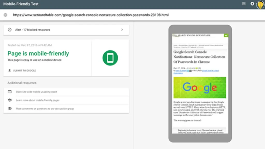
1. Google Mobile-Friendly Test
The Google Mobile-Friendly Test is a free tool that allows you to check how well your site performs on mobile devices.
Just enter your URL, and Google will analyze the mobile usability of your site. It will show you any issues, such as text that’s too small or buttons that are hard to tap, which may affect the user experience.
2. Page Speed Insights
Page Speed Insights is another Google tool that not only checks the loading speed of your site but also evaluates its mobile-friendliness.
Since mobile users tend to leave websites that take too long to load, optimizing speed is crucial. Page Speed Insights will provide actionable suggestions to improve mobile performance and speed, making it an essential tool for mobile optimization.
3. Manual Checks on Different Devices
While tools are helpful, it’s always a good idea to test your site manually on various mobile devices. Open your site on a smartphone or tablet and see how it looks and works.
Check the responsiveness, load times, and ease of navigation. Testing across multiple devices ensures your site works for all users.
What are the Key Elements of a Mobile-Optimized Website
Creating a mobile-optimized website requires a balance of design, performance, and usability to ensure visitors have a seamless browsing experience across all devices.
Below are the essential elements that define effective mobile website optimization in 2025:
1. Responsive Web Design
With responsive web design, your site automatically adapts its layout, visuals, and content to fit any screen size. Whether someone is browsing on a smartphone, tablet, or desktop, the site should remain functional, visually consistent, and easy to navigate without manual zooming or horizontal scrolling. A mobile-friendly website design also improves user engagement and supports better search engine rankings.
2. Mobile Page Speed Optimization
Fast-loading pages are critical for retaining mobile visitors. In 2025, users expect websites to load almost instantly, and search engines consider page speed a significant ranking factor. To improve mobile performance:
- Compress images to reduce file sizes without affecting quality.
- Minify HTML, CSS, and JavaScript to streamline code.
- Leverage a Content Delivery Network (CDN) to speed up content delivery for users in different regions.
- Implement lazy loading to load images and videos only when needed.
Focusing on speed directly enhances user experience and reduces bounce rates, which can positively influence conversions.
3. Touch-Friendly Design
Since mobile users rely on touchscreens, the site’s design should prioritize touch-friendly interactions. Designing touch-friendly buttons and menus,links, and interactive elements should be large enough to tap comfortably, with adequate spacing to avoid accidental clicks. Avoid hover-based actions, which do not work well on mobile devices. A simple, intuitive interface encourages users to stay longer and engage more effectively.
4. Simplified Navigation and User Experience
Mobile users prefer clean, straightforward navigation. Your site’s layout should smoothly direct visitors toward key pages and actions. Some best practices are:
- Using hamburger menus for compact navigation.
- Keeping headers and calls-to-action visible and accessible.
- Limiting excessive scrolling with a logical content hierarchy.
- Designing intuitive paths that help users complete tasks quickly.
A streamlined navigation structure improves usability and increases conversion opportunities.
5. Responsive Typography and Fonts
Responsive typography ensures that text remains clear, readable, and well-formatted across all screen sizes. Using relative units like em or rem allows fonts to scale automatically on different devices. Body text should be at least 16px, headings should adjust based on screen width, and proper line spacing improves readability. Optimized typography enhances user experience and reduces bounce rates, making it an important factor in mobile website optimization.
6. Optimized Fonts and Readability
Ensuring readability is an essential part of optimizing a mobile website. On smaller screens, text should remain clear and easy to read without zooming. To achieve this:
- Use sufficiently large font sizes, typically 16px or more for body text.
- Ensure strong contrast between text and background for better visibility.
- Maintain appropriate spacing between lines and sections.
Optimized typography enhances comprehension and keeps users engaged.
7. Mobile Viewport Settings
Viewport settings determine how a site appears on mobile devices. By adding a meta viewport tag, your website adjusts properly to the screen’s width:
<meta name=”viewport” content=”width=device-width, initial-scale=1″>
Using a responsive layout with fluid grids and avoiding fixed-width designs creates a consistent experience across devices. Proper viewport configuration prevents horizontal scrolling and supports Google’s mobile-first indexing, improving both usability and SEO.
By focusing on these elements — responsive design, fast performance, touch-friendly interactions, simplified navigation, and readable typography — you create a mobile-friendly website that delivers a smooth user experience, supports higher search rankings, and improves overall engagement.
How to Improve Mobile User Experience (UX) in 2025
To improve mobile UX and mobile site performancein 2025, focus on personalization, clear visual hierarchy, above-the-fold optimization, and micro-interactions — going beyond basic speed and responsiveness. A seamless, intuitive experience leads to lower bounce rates, higher engagement, and better SEO performance.
What is the Difference Between Mobile-First and Responsive Design? Are they both the same thing
No, mobile-first design and responsive design are not the same thing — they are related but different concepts. Let me explain directly and clearly:
Mobile-first design means creating a website starting from the smallest screen size and then scaling it up for larger devices. It prioritizes mobile users first, focusing on speed, usability, and essential content.
Responsive design, on the other hand, ensures the same website layout automatically adapts to all screen sizes — desktop, tablet, and mobile — using flexible grids, images, and media queries.
In short: mobile-first is a design approach, while responsive design is a design technique to make websites work on all devices.
How to Design Menus for Mobile Websites
Designing menus for mobile websites requires balancing usability, clarity, and space optimization. Since mobile screens are smaller and users expect quick access to information, your navigation must be simple, intuitive, and touch-friendly.
1. Keep Navigation Simple and Minimal
Limit the number of visible menu items to focus on the most important pages. Overloading users with too many choices can complicate navigation. Use simple, clear labels so visitors instantly know where each link will take them.
2. Use a Hamburger or Collapsible Menu
Hamburger menus have become the standard for mobile navigation because they save space while keeping the interface clean. When tapped, the menu expands to reveal navigation links, ensuring the design remains clutter-free without compromising accessibility.
3. Make Menus Touch-Friendly
Since mobile browsing is touch-first, ensure menu items are large enough to tap comfortably. Keep sufficient spacing between clickable elements to prevent accidental taps. Buttons and links should follow responsive web design best practices to ensure smooth interaction on different screen sizes.
4. Keep Essential Links Easily Accessible
Frequently visited sections like Home, Shop, Contact, or Login should be visible without extra clicks. Sticky headers can keep key navigation elements accessible at all times, improving usability and engagement.
5. Organize with Clear Hierarchies
For websites with many categories or products, use nested menus or accordion-style navigation. Group related links logically to help users find information faster while keeping the interface clean and intuitive.
6. Optimize for Performance and Speed
Avoid overly complex animations or scripts that delay menu interactions. Menus should load instantly and respond smoothly to user input, especially on mobile networks where speed is critical.
7. Test Across Multiple Devices
Always test your menus on various smartphones and tablets to ensure responsiveness and usability. What looks good on one screen size may not perform well on another, so cross-device testing is essential.
An effective mobile menu should be minimal, intuitive, touch-friendly, and fast. By following these principles, you create a mobile-friendly website design that improves user experience, supports mobile website optimization, and aligns with Google’s mobile-first indexing for better rankings in 2025.
Regularly testing your website with Mobile Page Speed Insights helps you identify performance bottlenecks and optimize loading times for mobile users.
Optimize Content for Mobile Users
Optimizing content for mobile users is Vital in today’s rapidly changing digital landscape.
Mobile users expect quick, easy-to-read, and engaging content. Here are some key strategies to make your content mobile-friendly and improve mobile content optimization.
1. Shorter Paragraphs
Long blocks of text can overwhelm mobile readers.
To keep your audience engaged, break your content into shorter, bite-sized paragraphs.
Aim for 2-3 sentences per paragraph to make your text more digestible. Short paragraphs are easier to read on smaller screens, which keeps users focused and reduces the chance they’ll leave your site.
2. Scannable Content
Mobile readers often scan content rather than reading it word by word.
To cater to this, make your content scannable by using bullet points, numbered lists, and clear subheadings. This helps users find key information quickly. If your content is easy to skim, readers are more likely to stay engaged and spend more time on your site.
3. Use of Visuals Wisely
Visuals like images and videos can enhance your content, but overusing them can slow down your website, especially on mobile devices.
Be selective with visuals, and ensure they’re properly optimized for faster loading times. Use images that support your message and improve the user experience, rather than overwhelming your readers with unnecessary media.
you’ll create content that is easy to read, quick to load, and highly engaging for mobile users. This not only improves the user experience but also boosts your SEO ranking by reducing bounce rates and increasing user engagement.
What are the Best Technical SEO Practices for Mobile Optimization in 2025
Technical SEO for mobile optimization focuses on improving your website’s backend performance and mobile usability so search engines can crawl, index, and rank your pages effectively. Guarantees that your website provides a smooth, quick, and hassle-free experience on any mobile device.
Key practices include:
1. Implement a Mobile-Friendly XML Sitemap
Create and submit a mobile-friendly XML sitemap in Google Search Console to help search engines discover and index your mobile pages efficiently.
2. Optimize Core Web Vitals
By 2025, Core Web Vitals have become a crucial factor for mobile SEO:
- LCP (Largest Contentful Paint) → Should load within 2.5 seconds.
- FID (First Input Delay) → Aim for less than 100ms.
- CLS (Cumulative Layout Shift) → Keep layout shifts minimal.
Fast, stable pages improve both UX and search rankings.
3. Use Structured Data Markup
Implement schema markup to make your content easier for search engines to interpret. Structured data can enhance mobile results with rich snippets, improving click-through rates (CTR).
4. Enable Lazy Loading
Use lazy loading for images and videos to load only on-screen content first, boosting page speed and mobile performance.
5. Avoid Intrusive Pop-Ups and Interstitials
Pop-ups that block the main content frustrate users and can harm your rankings. Use non-intrusive banners or slide-ins instead.
6. Optimize Mobile Viewport and Rendering
Ensure proper viewport settings, use responsive layouts, and avoid fixed-width designs to deliver a consistent mobile experience.
7. Minify CSS/JS and Caching Strategies for Faster Mobile Pages
Minify and Optimize CSS/JS for Mobile
Goal: ship less code, and make what remains non-blocking.
- Minify & compress: Remove whitespace/comments and shorten identifiers; serve over Brotli (preferred) or gzip.
- Tree-shake & dead-code eliminate: Strip unused functions, utility classes, and polyfills not needed for target devices.
- Code-split by route: Deliver only what a view needs; avoid a single, monolithic bundle.
- Inline critical CSS; defer the rest:
- Inline above-the-fold CSS.
- Load remaining styles with media=”print” + onload swap or a rel=”preload” pattern.
- Inline above-the-fold CSS.
- Defer/async JavaScript:
- Apply ‘defer’ for essential app scripts and ‘async’ for independent third-party scripts.
- Move non-essential logic (carousels, analytics, chat) to idle or interaction-triggered loads.
- Apply ‘defer’ for essential app scripts and ‘async’ for independent third-party scripts.
- Prefer modern bundles: Serve type=”module” to modern browsers; avoid heavy transplantation where not needed.
- Reduce third-party cost: Audit tags; self-host critical libraries when possible; remove redundant SDKs.
- HTTP/2/3 aware: Multiplexing reduces the need to over-bundle, but don’t explode requests; keep a balanced number of files.
Mobile Caching Strategies
Goal: make repeat visits instant while keeping content fresh.
- Strong HTTP caching for static assets:
- Versioned filenames (fingerprints) like app.8f3c1.js.
- Cache-Control: public, max-age=31536000, immutable for CSS/JS/images.
- Use ETag/Last-Modified only for assets you don’t fingerprint.
- Versioned filenames (fingerprints) like app.8f3c1.js.
- Safer caching for HTML & APIs:
- HTML: Cache-Control: no-store, must-revalidate (or very low max-age) to avoid stale shells.
- API responses: choose per use-case—short max-age with stale-while-revalidate works well for lists/feeds.
- HTML: Cache-Control: no-store, must-revalidate (or very low max-age) to avoid stale shells.
- Service worker strategies (Progressive Web App):
- Cache-first for fingerprinted static assets (icons, fonts, core CSS/JS).
- Stale-while-revalidate for UI libraries and non-critical JSON—fast first paint, background refresh.
- Network-first for user-specific data (carts, dashboards) to ensure freshness, with cache fallback offline.
- Precache the minimal “app shell” to guarantee instant loads after first visit.
- Cache-first for fingerprinted static assets (icons, fonts, core CSS/JS).
- Responsive images & edge caching:
- Serve WebP/AVIF where supported; generate size-appropriate variants and cache at the CDN edge.
- Use srcset/sizes and lazy-loading to cut initial bytes.
- Serve WebP/AVIF where supported; generate size-appropriate variants and cache at the CDN edge.
- Invalidate predictably:
- Fingerprinting handles long-term assets; purge CDN on deploy for non-fingerprinted content.
- Keep a manifest so the service worker updates cleanly.
- Fingerprinting handles long-term assets; purge CDN on deploy for non-fingerprinted content.
- Don’t cache sensitive content: Auth pages, personal data, and checkout steps should use no-store.
- Measure & verify: Track real-user metrics (LCP, CLS, INP) and re-test after each change; ensure cache headers are actually applied.
These practices keep mobile payloads small, render paths unblocked, and repeat visits near-instant—improving user experience and supporting stronger rankings without over-optimization.
Prioritizing technical SEO — including Core Web Vitals, structured data, lazy loading, mobile sitemaps and minifying the CSS/JS and Caching Strategies for Faster Mobile Pages makes your site mobile-friendly, search-optimized, and fully aligned with Google’s mobile-first indexing standards for 2025.
Run your website through Mobile Page Speed Insights today to uncover hidden speed issues and make your site truly mobile-friendly

Do You Need AMP for Mobile Optimization in 2025?
No — AMP (Accelerated Mobile Pages) is no longer essential for mobile optimization in 2025. Google no longer gives AMP-specific ranking benefits, and Core Web Vitals now play a bigger role in SEO.
Instead of implementing AMP, focus on:
- Fast mobile page speed (under 2.5 seconds)
- Responsive web design for all screen sizes
- Optimized images and lazy loading
- Clean, lightweight code
If your site already delivers an excellent mobile-friendly website design and passes Core Web Vitals, AMP isn’t necessary for strong rankings or user experience.
How to Improve Website Speed on Mobile Devices
To improve website speed on mobile devices in 2025, focus on optimizing performance for a seamless mobile user experience and better Google rankings. Compress and use next-gen image formats like WebP or AVIF, minify and defer CSS/JS to reduce file sizes, and enable browser caching and CDNs for faster content delivery. Implement lazy loading for images and videos, optimize fonts to reduce load times, and ensure your site meets Core Web Vitals benchmarks for speed and stability.
Regularly test performance using the top tools like Google PageSpeed Insights, Lighthouse, or GTmetrix to identify and fix bottlenecks. A fast, mobile-friendly website design enhances user engagement, lowers bounce rates, and improves visibility under Google’s mobile-first indexing.
Mobile Optimization for eCommerce Sites
Mobile optimization for eCommerce is essential for driving conversions and keeping customers happy.
With more people shopping on their mobile devices, it’s important to ensure your online store is optimized for mobile users. Here are some key areas to focus on for mobile eCommerce optimization:
1. Mobile-Friendly Product Pages
Your product pages should be designed for mobile users. This means using high-quality images that load quickly and ensuring the product descriptions are clear and easy to read on smaller screens.
Use mobile-responsive design so that the page adapts to different screen sizes. A clutter-free layout, with easy-to-read fonts and well-organized product information, will improve the shopping experience.
2. Easy Checkout Process
One of the most critical aspects of mobile checkout UX is simplicity.
Avoid long forms or unnecessary steps during checkout. Implement auto-fill options where possible, and make sure the entire process is mobile-friendly.
The easier it is to complete a purchase, the less likely users are to abandon their carts. A seamless checkout experience is key to turning mobile visitors into paying customers.
3. Payment Integration
Make sure your payment system works smoothly on smartphones and tablets.
Offer popular mobile payment options like Google Pay, Apple Pay, and credit card integrations that work smoothly on smartphones.
Make the payment process as easy and secure as possible to increase trust and conversion rates. Additionally, ensure that any payment forms are user-friendly and mobile-responsive to avoid frustration during the transaction.
By focusing on essential aspects of mobile eCommerce optimization, you’ll create a shopping experience that’s not only user-friendly but also optimized for mobile search and conversions. With the rise of mobile shopping, taking these steps will help ensure your eCommerce site stays competitive.

Common Mobile Optimization Mistakes to Avoid
Mobile optimization is essential for delivering a seamless user experience and improving your website’s search rankings. However, many websites still make common mobile SEO mistakes that can hurt mobile performance. Here are key mobile optimization issues to avoid:
1. Not Testing on Real Devices
One of the most significant mistakes in mobile optimization is relying solely on emulators or simulators.
While these tools can help, they don’t replicate the real mobile experience. Testing your site on actual mobile devices across different screen sizes, brands, and operating systems is crucial.
Skipping this can result in layout issues or broken functionality that will drive users away and affect your mobile SEO rankings.
2. Using Intrusive Pop Ups
Pop ups can be effective for grabbing attention, but they can quickly frustrate mobile users, especially if they are too large or difficult to close.
Google penalizes sites that use intrusive pop ups that block content, particularly on mobile. Ensure your pop-ups are small, non-intrusive, and easy to dismiss, which will improve both mobile UX and your SEO performance.
3. Using Flash or Outdated Technology
Flash is outdated and not supported on many mobile devices, particularly on iOS.
Using Flash or other non-mobile-friendly technologies can lead to slower page loads and poor user experience, ultimately affecting your mobile rankings. Stick to modern technologies like HTML5 for multimedia content to ensure your website is fully mobile-compatible.
4. Slow Page Load Times
Mobile users expect fast-loading websites.
Slow page speeds on mobile can lead to higher bounce rates and lower rankings in search engines.
Optimize mobile page speed by compressing images, minimizing code (HTML, CSS, JavaScript), and using a content delivery network (CDN) to improve load times. Faster pages lead to better mobile SEO and a better user experience.
By avoiding mobile optimization mistakes, you’ll boost your website’s performance, keep visitors engaged, and improve your search engine rankings, ensuring your site is mobile-friendly and search engine optimized.
Whar are the Best Tools to Test and Optimize Your Website for Mobile in 2025
When it comes to mobile SEO and improving your website’s mobile performance, using the right tools can make all the difference. Here are some of the most effective mobile website testing tools you can use to optimize your site for mobile users:
1. Google Mobile-Friendly Test
Google’s Mobile-Friendly Test is one of the most straightforward and powerful tools for checking how well your site performs on mobile devices.
It quickly analyzes your page and tells you whether it’s mobile-friendly, offering suggestions for improvements. This tool helps you ensure your site meets Google’s mobile-first indexing criteria, which is essential for better rankings in search results.
2. PageSpeed Insights
Page Speed Insights by Google is an essential tool for evaluating your website’s loading speed, particularly on mobile.
Since fast load times are crucial for both mobile user experience and SEO, this tool helps you identify performance issues like slow page loads and provides actionable recommendations for improving speed. Optimizing your mobile page speed is key to preventing high bounce rates.
3. GTMetrix
GTMetrix is another popular tool that helps you analyze your site’s performance.
It provides detailed reports on how well your site loads on mobile devices, including metrics such as load time, page size, and number of requests. GTMetrix also offers suggestions for optimizing mobile page speed, such as image compression and code compression.

4. BrowserStack
For thorough testing across multiple mobile devices and browsers, BrowserStack is a great tool.
It allows you to test your website’s mobile responsiveness on real devices in real-time, ensuring your site functions well across various screen sizes and operating systems. This is crucial for fixing mobile display issues that might not show up in standard emulators.
5. Lighthouse
Lighthouse is an open-source tool from Google that provides audits for performance, accessibility, SEO, and mobile usability.
It generates a detailed report on how well your site performs on mobile devices and offers specific suggestions to improve mobile user experience and overall site optimization.
Using mobile SEO tools and mobile website testing tools will help you identify and fix issues that can affect your site’s performance, user experience, and SEO rankings. By regularly testing your site on multiple devices and improving mobile-specific metrics, you can ensure your website is fully optimized for mobile users.
Which are Top Mobile-Friendly Website Examples in 2025
A mobile-friendly website adjusts smoothly to different screen sizes, offering a great browsing experience. Some good examples include:
- Amazon → Fast-loading, easy navigation, and large tap-friendly buttons for seamless shopping.
- Airbnb → Clean design, responsive layouts, and smooth booking experience on mobile.
- Nike → High-quality visuals, responsive design, and a quick, mobile-friendly checkout.
- Starbucks → Mobile ordering, location-based store finder, and intuitive navigation.
- Spotify → Minimalist design, optimized media loading, and smooth mobile browsing.
These mobile-friendly website examples showcase best practices in responsive design, fast performance, and user-focused navigation. By analyzing their strategies, businesses can improve their own mobile website optimization and deliver a better mobile user experience in 2025.
What are the best practices and strategies for mobile Optimization in 2025(Quick Recap)
To achieve better rankings and deliver a seamless mobile experience in 2025, focus on these essentials:
- Design mobile-first and adopt responsive layouts.
- Boost page speed by compressing images, streamlining code, and leveraging CDNs.
- Meet Core Web Vitals benchmarks for faster, stable, and responsive pages.
- Ensure touch-friendly navigation with clear menus and visible CTAs.
- Use structured data for better visibility in AI Overviews and rich results.
- Run frequent tests with tools such as PageSpeed Insights and Lighthouse.
Turn Mobile Traffic into Conversions
In 2025, success online depends on how well you manage mobile website optimization. As mobile usage continues to dominate, delivering a fast, responsive, and mobile-friendly website design is no longer optional — it’s essential for higher rankings, better user engagement, and increased conversions.
At Local City Solutions, we specialize in mobile SEO strategies that make your website faster, smarter, and fully optimized for today’s mobile-first world. Whether you want to boost performance, improve user experience, or dominate Google’s mobile search results, we can help you achieve measurable results.
Ready to turn your mobile visitors into loyal customers?
Contact Local City Solutions today and start optimizing your website for maximum growth in 2025 and beyond.
