
To design a high-converting landing page, focus on a single clear goal, use persuasive headlines, place a strong call-to-action above the fold, keep the design clean and mobile-friendly, and test every element for performance.
This approach ensures visitors instantly understand your offer, stay engaged, and are more likely to convert.
A high-converting landing page is built to grab attention instantly, guide visitors effortlessly, and inspire them to take one clear action and in this guide, you’ll learn exactly how to craft one from scratch.
Whether your goal is to boost leads, increase sales, or improve online performance, the strategies you’ll find here are designed to help you achieve measurable results. If you’ve ever wondered why some pages turn clicks into customers while others fall flat, you’re in the right place.
This step-by-step resource walks you through the process of designing a landing page that doesn’t just look appealing but delivers real business impact. You’ll explore proven design techniques that enhance visual appeal, essential user experience (UX) principles that keep visitors engaged, and conversion-focused methods that encourage them to act. Along the way, you’ll see examples of high-performing landing pages, learn about common mistakes to avoid, discover tools that simplify the process, and find ways to track and improve your results.
Here’s a standout fact:
A recent 2025 MarketingCharts study revealed that landing pages with a single, well-defined call-to-action outperform those with multiple goals by over 68%. Additionally, mobile-friendly and fast-loading pages experience a 34% boost in engagement a crucial advantage in today’s competitive digital landscape.
Your landing page is often the first and sometimes only opportunity to make a lasting impression. If it’s slow, cluttered, or confusing, visitors will leave within seconds. When properly optimized, it can turn into one of the most effective tools in your marketing toolkit.
So, if you’re done guessing and ready to apply strategies that work, this guide is your blueprint. Expect actionable tips, practical examples, and clear steps to create a landing page that speaks to your audience and drives conversions.
Let’s get started
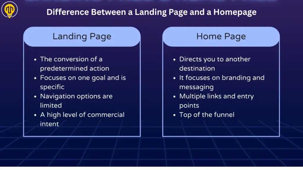
What Is a High-Converting Landing Page?
A high-converting landing page is a focused web page designed to capture attention, build trust instantly, and guide visitors toward taking one specific, desired action.
Unlike a homepage that shows everything about your brand from blog links to company history a landing page is laser-focused. There are no distractions, no extra links, and no mixed messages. Just one clear path that helps visitors say “yes” to what you’re offering.
A landing page isn’t just about design—it’s built to drive action, turning visitors into leads or paying customers. And that’s where the magic of conversion-focused structure comes in.
These are the key elements that make a landing page truly effective:
- A clear and bold headline that instantly tells the visitor what’s in it for them.
- A brief and straightforward statement that connects with what the visitor is looking for.
- A strong call-to-action (CTA) that’s impossible to miss.
- Visuals or trust signals like testimonials, reviews, or logos to build credibility.
- And most importantly, zero clutter. Everything is there for one reason: conversion.
If you’re still wondering why this matters, just look at the numbers.On average, landing pages see a conversion rate of about 9.7%, but the highest-performing ones in the top 25% achieve rates exceeding 20%. That’s the difference between a page that works… and one that wins.
To sum it up: a high-converting landing page doesn’t try to do everything. It focuses on doing one thing really well and that’s turning visitors into results.
How Long Should a Landing Page Be?
A landing page should be as long as needed to answer every question and remove every objection — typically 500–1500 words depending on the offer.
Short pages work best for simple products or lead magnets, while long-form pages with benefits, testimonials, and FAQs are ideal for high-ticket items or complex services. The secret is to keep only what’s essential to inspire action—cut out the fluff and avoid distractions.
What Are Landing Page Performance Metrics?
Landing page performance metrics are key indicators that help you measure how well your landing page is performing in terms of engagement, conversions, and user behavior. Monitoring these metrics reveals what’s effective and highlights areas that need enhancement.
Key Landing Page Performance Metrics:
- Conversion Rate – Percentage of visitors who complete your desired action (e.g., filling a form, clicking CTA).
- Bounce Rate – Percentage of visitors who leave without interacting; a high bounce rate signals poor relevance or user experience.
- Average Time on Page – How long users stay; more time usually means higher interest.
- Click-Through Rate (CTR) – Indicates the percentage of visitors who clicked on your call-to-action or other links.
- Traffic Sources – Shows where your visitors come from (e.g., search, social, paid ads).
- Form Drop-Off Rate – Tracks how many users start entering information but exit before submitting the form.
- Scroll Depth – How far users scroll; useful to gauge interest in your content.
- Page Load Time – Speed matters—slow pages often lose conversions.
- Mobile vs. Desktop Performance – Compare how your landing page performs on different devices.
- Heatmaps & User Recordings – Visual tools showing how users interact with your page.
Tracking these landing page performance metrics helps you make data-driven changes that lead to higher engagement, better user experience, and more conversions.
What Are the Essential Features of a High-Converting Landing Page?
When it comes to building a landing page that truly converts, design plays a bigger role than most people realize. It’s not just about how the page looks, it’s about how it leads the user toward a clear and intentional action.
A successful landing page is structured in a way that reduces friction, builds trust, and makes it easy for the visitor to take the next step.
Key Good Elements of a High-Converting Landing Page Design
- What Makes a Headline Effective on a Landing Page?
- How to Write Strong and Clear Call-to-Actions (CTAs)?
- Why Is a Clean and Structured Layout Important for Landing Pages?
- How Do Visuals and Multimedia Improve Landing Page Performance?
- Why Should Landing Page Designs Avoid Distractions?
- What Is a Unique Selling Proposition (USP) and Why Does It Matter?
- How to Create Simple Forms That Encourage Conversions?
- What Are the Best Trust Signals to Use on a Landing Page?
- How to Optimize a Landing Page for Mobile and Fast Loading Times?
Below are the key essential features of a high-converting landing page that combine design, messaging, and strategy to drive results.
1. A Headline That Instantly Grabs Attention
Your headline is the very first thing visitors notice and often the one factor that determines whether they’ll stay or leave. It must speak directly to their needs or interests within a few short seconds.
Why It Matters
An impactful headline instantly highlights the benefit of what you’re offering.It should be bold, specific, and benefit-driven — ideally answering the visitor’s question: “What will I get here?”
Tips for Writing Compelling Headlines
- Keep it focused on a clear benefit, not just a product name or feature.
- Incorporate powerful verbs or emotional cues that connect with your audience.
- Make sure the headline matches the ad, email, or link that directed the visitor to your page.
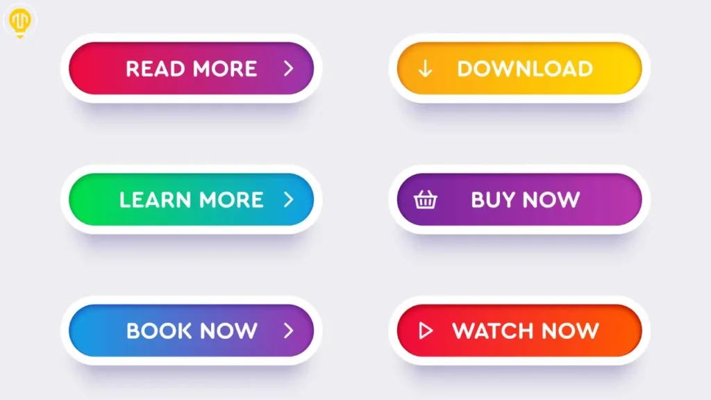
2. Clear and Action-Oriented Call-to-Actions (CTAs)
A landing page without a clear call-to-action is like a shop with no checkout counter. Your CTA tells the visitor exactly what to do next — whether it’s to sign up, download, or make a purchase.
Why It Matters
CTAs are critical for conversions. A weak or confusing CTA can cost you valuable leads, no matter how engaging the rest of your content is.
How to Improve CTA on a Landing Page?
To improve your CTA (Call to Action) on a landing page, make it clear, specific, and action-oriented. Choose clear, action-driven words such as ‘Get,’ ‘Download,’ or ‘Start’ to guide visitors. Position your call-to-action where it’s immediately visible and repeat it thoughtfully throughout the page.
Use contrasting colors so the button stands out, and keep the text short—ideally 2 to 5 words. Add urgency or value (e.g., “Get Instant Access” or “Start Free Trial Now”) to motivate clicks. Also, ensure your CTA matches the intent of your landing page and aligns with what the visitor came looking for.
3. A Visually Clear and Intuitive Layout
An effective landing page must be visually clean and easy to follow. Visitors should be able to scan the page and understand what you’re offering without confusion or distraction.
Why It Matters
The human eye follows a predictable reading path. A strong visual layout guides that path — from the headline to the benefits, and finally to the call-to-action — without unnecessary clutter.
Best Practices for Layout
- Use consistent font sizes and spacing to create a clear hierarchy.
- Use generous spacing to keep the layout clean and prevent overwhelming your audience.
- Keep the overall layout simple, guiding the user toward one action.
4. Strong Visuals and Multimedia That Support the Message
Images, videos, and icons can enhance the effectiveness of a landing page when used intentionally. They help explain your message faster, create emotional impact, and make the content more engaging.
Best Practices
- Use high-quality, relevant visuals that reflect your product, service, or audience.
- Include short explainer videos or demo reels to build trust.
- Avoid generic stock images that add no real value.
Multimedia content should not distract, but rather reinforce your message and help guide the user through the experience.
5. Simple, Focused Design Without Distractions
Every element on your landing page should have a clear purpose. Unnecessary links, popups, or off-topic content can pull users away from converting.
Best Practices
- Remove top navigation and extra footer links to keep the user focused.
- Avoid mixing multiple offers or conflicting messages.
- Stay focused on a single objective; each page should serve one clear purpose.
A distraction-free layout increases clarity and improves the chances of conversion by reducing mental friction for the user.
6. A Clearly Communicated Unique Selling Proposition (USP)
Your Unique Selling Proposition (USP) is what makes your offer different or better than others. This should be front and center on your page — not buried in fine print.
How to Present Your USP Effectively
- Highlight what sets you apart: speed, pricing, results, support, guarantees, etc.
- Use short, bold benefit statements near your headline or CTA.
- Back your claims with stats or short testimonials where possible.
An obvious and clear USP gives the visitor a reason to choose you instead of your competitor.
7. Easy-to-Complete Forms with Minimal Fields
Forms are often the final barrier between a visitor and a conversion. If they’re too long or confusing, people will abandon them. A good landing page keeps the form short, simple, and reassuring.
Form Optimization Tips
- Request only the necessary details, such as a name and email, especially when offering a lead magnet.
- Use field labels and error messages to guide users.
- Let users know what happens after they submit the form (e.g., “You’ll receive your download by email.”)
Shorter forms increase conversion rates — especially for cold traffic — and make the user feel comfortable completing the action.
8. Trust Signals That Build Credibility
Trust is a major factor in whether a visitor will take action. By showcasing proof that others have benefited from your product or service, you reassure potential customers that they’re making the right choice.
Effective Trust Elements to Include
- Real customer testimonials with names and photos.
- Ratings, case studies, or media mentions.
- Security badges and guarantees.
9. Mobile Optimization and Fast Page Loading
With the majority of internet users browsing on mobile devices, it’s critical that your landing page works seamlessly across all screen sizes. Slow loading pages also frustrate users and increase bounce rates.
Optimization Checklist
- Ensure your design is responsive and adapts to all devices.
- Compress images and limit scripts to speed up load time.
- Test performance using tools like Google PageSpeed Insights or GTmetrix.
Each of these elements plays a crucial role in making your landing page more than just a good-looking page — they make it a conversion-focused tool. By blending smart design, clear messaging, and strategic structure, you create a smooth experience that builds trust and drives action.
What Are the Best Practices for Designing a Landing Page That Converts?
A high-converting landing page doesn’t just look good — it serves a purpose: turning visitors into leads or customers. To achieve this, your page should be carefully designed with intent, clarity, and user experience in mind. Below are the essential best practices that professionals follow to create landing pages that actually convert.
1. Give Your Content Space to Breathe
Instead of cluttering the page with too much information, use white space to make your message stand out. Clean layouts help guide your visitors’ attention to the most important elements — whether it’s a call-to-action, product highlight, or form.
2. Design With Your Ideal Visitor in Mind
Understand what your audience needs and shape your content around their expectations. Use words they relate to, visuals they resonate with, and offers they truly care about. The more tailored your page feels, the higher the chances of conversion.
3. Make It Seamless on Mobile Devices
Since most users browse on their phones, your landing page must load fast and look flawless on smaller screens. Ensure buttons are easy to tap, text is readable, and forms work without frustration.
4. Use Powerful, Story-Driven Images
Stock photos won’t cut it anymore. Choose visuals that help tell your brand’s story and build trust. Whether it’s a happy customer, a real product shot, or an in-action image — your visuals should support your message, not distract from it.
5. Optimize the Above-the-Fold Section
What a visitor sees before scrolling is prime real estate. Include your headline, unique selling point (USP), and primary CTA above the fold. Make it clear what action you want them to take — without making them dig for answers.
6. Stick to One Goal, One Message
Resist adding several offers or calls-to-action that could distract from the main goal.The best landing pages are laser-focused on a single goal — whether it’s signing up, downloading, or purchasing. This clarity helps reduce confusion and increases conversions.
7. Continuously A/B Test Key Elements
A landing page rarely gets everything right the first time. Test different headlines, CTA colors, images, and layouts to see what works best. A/B testing removes the guesswork and helps you find the most effective version of your page.
8. Eliminate Distractions Wherever Possible
Every element on your landing page should serve the main objective. Avoid unnecessary links, navigation bars, pop-ups, or content that pulls users away from your CTA. A distraction-free experience keeps the focus exactly where it needs to be.
How to Increase Landing Page Conversion Rate & Decrease Bounce Rate
To boost conversions and keep visitors from bouncing, focus on clarity, speed, and trust.
- Match Intent, Instantly
The headline and hero section should immediately reassure visitors they’re in the right place. Use simple, benefit-driven language that answers: What’s in it for me?
- Simplify the Design
Remove clutter. Keep the design simple, focus on a single call-to-action, and present information in an easy-to-read format.” Avoid distracting links or too many form fields.
- Build Instant Trust
Use social proof like testimonials, client logos, or trust badges. Visitors decide within seconds whether to stay—credibility keeps them hooked.
- Make It Fast & Mobile-Ready
A slow page kills conversions. Optimize loading speed and ensure everything looks great on mobile. Make sure your website is mobile user friendly.
- A/B Test Relentlessly
Test different headlines, CTAs, and visuals. What works on one landing page might flop on another—data will tell you what converts.
- Tell, Don’t Sell
Instead of pushing, guide the user. Show how your product or service solves a real problem with minimal hype and maximum relevance.
How to Optimize Landing Pages for Lead Generation?
To optimize a landing page for lead generation, design it to instantly communicate value, guide visitors with a clear path, and remove any barriers that could prevent them from taking action.
- Clear, compelling headline – Hook your visitor instantly.
- Clear Call to Action – Use compelling, action-driven wording and position it where visitors can see it immediately.
- Minimal form fields – Ask only for essential info (name, email).
- Benefit-focused content – Show how your offer solves their problem.
- Visual trust elements – Add testimonials, trust badges, or reviews.
- Fast load speed – Ensure your page loads in under 3 seconds.
- Mobile optimization – Design for mobile-first usability.
- No distractions – Remove menus or unnecessary links to keep focus on the conversion.
Optimizing for lead generation means removing friction and maximizing clarity, so users know exactly what to do and why they should do it.
How to Use Psychology in Landing Page Design
Designing a high-converting landing page isn’t just about clean visuals and persuasive text—it’s about tapping into how your audience thinks, feels, and acts. The psychology behind a highly effective landing page lies in understanding human behavior and weaving those insights into your design, layout, and messaging.
Here are the core psychological principles that will help you design psychologically powerful landing pages:
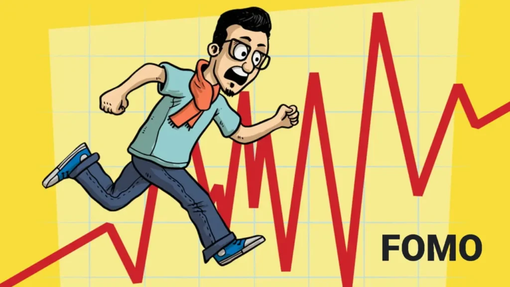
1. FOMO, Urgency, and Scarcity
The fear of missing out is a strong psychological driver that can influence decisions. When users believe a deal is temporary or limited, they are more likely to act quickly. Consider using:
- Countdown timers for limited-time offers
- Stock alerts such as “Only 3 left in stock”
- Flash sales that disappear after a certain time
These tactics create a sense of urgency that taps into a user’s instinct to avoid loss, making conversions more likely.
2. Color Psychology
Colors don’t just make your landing page look pretty—they communicate emotions and influence decisions.
- Blue builds trust (ideal for finance, SaaS)
- Red triggers urgency and excitement (use for CTAs)
- The color green often conveys a sense of renewal and calm, which works well for brands in the health and wellness space.
- Black conveys luxury and exclusivity
Choose colors that align with your brand tone and the emotions you want users to feel.
3. Emotional Triggers in Copywriting
The color green often conveys a sense of renewal and calm, which works well for brands in the health and wellness space.
Use emotionally charged language to:
- Highlight pain points (“Tired of slow-loading websites?”)
- Highlight what users will gain (e.g., ‘Boost your leads without spending more on ads’).
- Create identity alignment (“Built for small businesses who think big”)
Including testimonials and social proof builds trust and reduces the sense of risk for potential customers.
People Need to See a Clear Return or Benefit
Before users commit—whether it’s giving an email or making a purchase—they ask one question: “What’s in it for me?”
A powerful landing page answers this instantly by highlighting the transformation or benefit instead of just listing features. Benefits should be visible above the fold and supported by visual cues or headlines that promise value.
Instead of saying “Our platform offers analytics tools,” say “Understand your audience 10x faster with actionable insights.”
Persuade Through Social Proof
Humans follow others especially when unsure. Displaying testimonials, reviews, user counts, badges, or logos of companies you’ve worked with gives new visitors confidence. This taps into social validation—a critical concept in landing page psychology.
“Join 15,000+ marketers already growing with us” is more persuasive than a basic claim of quality.
Avoid Overblown Claims That Damage Trust
Here’s a common mistake: overhyping your offer to sound more impressive. While bold headlines catch attention, exaggerated or unrealistic promises can instantly erode trust. Clarity, authenticity, and specificity win over empty hype.
Don’t say: “The #1 product on the planet!”
Say: “Trusted by 10,000+ businesses across 30 countries.”
Trigger Emotions with Storytelling and Copy
Emotion drives action. Write content that speaks to your audience’s struggles, goals, or concerns. Begin with a familiar challenge and position your solution as the answer. This psychological trigger in landing page design creates a compelling narrative that converts.
Use emotional headlines like:
“Tired of wasting hours on manual reporting? Here’s a smarter way.”
To build a psychologically powerful landing page, you must design not just for clicks, but for human emotion, trust, and motivation. When you combine benefit-driven messaging, urgency, emotion, and social validation, you’re not just designing a page—you’re guiding a decision.
Real Examples of High-Converting Landing Pages (With Takeaways)
Seeing theory in action helps you better understand what works and why. Below are real-world landing page examples that excel in conversion—and what you can learn from them.
Example 1 – SaaS Landing Page: Slack
What works:
Slack’s landing page showcases a straightforward headline, brief value-focused statements, and one clear call-to-action: ‘Try for free’. It uses trust-building logos (Netflix, Uber, etc.) and has minimal distractions.
Takeaway:
- Use a strong headline that communicates value
- Show social proof with recognizable brand names
- Stick to one clear action (e.g., “Try for Free”)
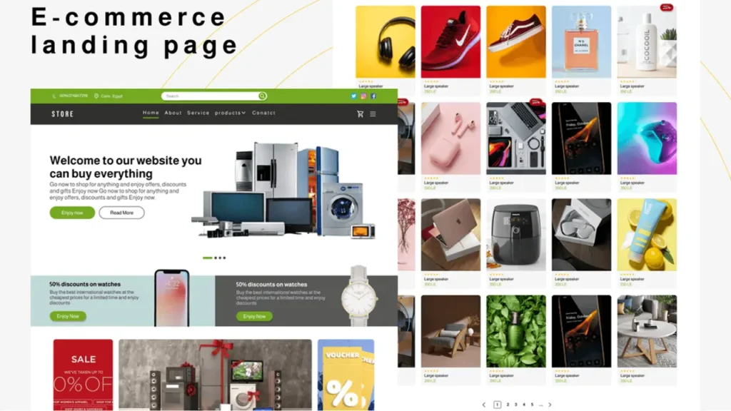
Example 2 – Product Landing Page for eCommerce: Casper Mattress
What works:
Casper’s product pages feel clean and personal. High-quality visuals show the product in action. It uses urgency phrases (“Limited Offer”), customer reviews, and benefit-driven bullet points.
Takeaway:
- Use visual storytelling to show the product’s value
- Add trust indicators (star ratings, reviews)
- Include urgency near CTAs to speed up decisions
Example 3 – Lead Generation Landing Page: HubSpot eBook
What works:
HubSpot offers free eBooks in exchange for emails. The content clearly outlines what users will gain and features a compelling visual of the guide. No clutter, no distractions.
Takeaway:
- Offer value in exchange for contact info
- Use a minimal form (name, email only)
- Align your headline and visual with the content offer
Common Landing Page Design Mistakes to Avoid
A poorly designed landing page can significantly reduce conversions, waste ad spend, and harm your brand credibility. Here are some of the most common landing page design mistakes that kill performance — along with practical insights on how to fix them.
1. Too Many CTAs
While it might seem like more CTAs give users more options, in reality, multiple calls to action create confusion and decision fatigue. A high-converting landing page should be focused and goal-oriented — typically with one clear, compelling CTA that guides the user toward a single conversion point.
Fix: Use a singular, action-driven CTA and reinforce it throughout the page with contextual relevance.
2. Lack of Visual Clarity and Poor Imagery
A cluttered layout, low-quality images, and poor visual hierarchy are classic landing page design errors that immediately lower trust and engagement. Your visuals should support the message, guide the user’s attention, and reflect your brand’s quality.
Fix: Invest in high-resolution, relevant images and structure your content with whitespace, bullet points, and clear sections that enhance readability.
3. Weak Copywriting
Your landing page copy is your pitch — and if it fails, so does your conversion. Vague, exaggerated, or keyword-stuffed text will turn away modern users who are trained to detect inauthenticity.
Fix: Write copy that is clear, benefit-driven, and emotionally persuasive, rooted in the psychology behind a highly effective landing page. Use power words, proof points, and genuine tone to connect with your audience.
4. Bad Mobile Experience and Slow Load Times
If your landing page doesn’t perform well on mobile or takes more than a few seconds to load, you’re losing users — and conversions.
Fix: Use a responsive design framework and compress images/scripts to ensure fast page speed. Always test your page on multiple screen sizes before launching.
5. Missing or Weak CTA
A call to action is the final nudge. If it’s missing, buried, or unclear, you’ve wasted the user journey. Even beautifully designed pages fail if there’s no obvious next step.
Fix: Make sure your call-to-action stands out, encourages action, and appears both at the top of the page and near the bottom. Use buttons, directional cues, and urgency where appropriate.
6. Misleading Headlines
Clickbait-style or vague headlines might get initial clicks but cause high bounce rates. If your headline doesn’t align with your offer, users will lose trust quickly.
Fix: Write headlines that are clear, value-oriented, and accurately reflect the page content. Use headline testing tools or A/B tests to find what converts.
7. No Social Proof
Users often need reassurance before making a decision. Landing pages without testimonials, case studies, or logos of trusted partners can feel risky and untrustworthy.
Fix: Include authentic testimonials, reviews, trust badges, and social counters where relevant to add persuasive power.
8. Too Much Information or Cluttered Layout
A landing page isn’t a full website. Overloading it with text, features, or links distracts the user and reduces clarity.
Fix: Focus on the core offer and its benefits. Every element on the page should either build trust or guide users toward the conversion goal.
9. No SEO Optimization
Even the best landing pages can fail if they’re not optimized for search engines. Poor on-page SEO practices mean lost organic traffic and missed visibility.
Fix: Include relevant keywords like “landing page optimization mistakes” and their LSI terms, optimize meta tags, image alt text, and ensure crawlability.
10. Outdated Design and UX Practices
Landing pages that look like they’re from 2012 don’t inspire confidence. Design trends evolve, and so do user expectations.
Fix: Use modern, clean design principles with updated UI components, current color psychology, and intuitive layout for maximum engagement.
Most low-converting landing pages fail because they ignore user psychology, overload the visitor, or provide unclear direction. Prevent low conversion rates by reviewing your landing page for clear design, compelling copy, emotional appeal, and smooth technical performance.
A successful landing page is not just visually appealing — it’s strategically built to guide users through a focused journey, driven by trust, relevance, and compelling action.
Tools to Help You Design and Optimize Landing Pages in 2025
Creating a high-converting landing page requires more than just a good idea — you need the right tools to build, test, and refine every element of your page. Whether you’re a beginner or a seasoned marketer, the right landing page software can make a big difference in both performance and user experience.
Here are some of the top landing page design tools in 2025 that are widely used by marketers, designers, and businesses to create high-converting, visually appealing landing pages—without needing to code.
1. Unbounce
A powerful, conversion-focused tool with drag-and-drop functionality, A/B testing, smart traffic routing, and AI content generation features. Ideal for marketers aiming for lead generation and optimization.
2. Instapage
Known for its clean UI, advanced analytics, heatmaps, and collaboration features. Great for teams running PPC campaigns and performance marketing.
3. Webflow
Combines visual design with full website control. Perfect for designers who want pixel-perfect control without writing code. Great for responsive and interactive landing pages.
4. Leadpages
Easy-to-use tool for small businesses and entrepreneurs. Offers built-in templates, integrations, and fast publishing—excellent for quick lead capture and promotions.
5. ClickFunnels
Built for sales funnels with landing page creation at its core. Best for eCommerce, course creators, and anyone focusing on conversion paths.
6. Elementor (for WordPress)
A top WordPress page builder plugin that allows full customization of landing pages using a drag-and-drop editor. Best for WordPress-based websites.
7. Carrd
Lightweight and cost-effective, Carrd is perfect for simple one-page landing sites, especially for freelancers, portfolios, and email opt-ins.
Analytics & Testing Tools
Designing a page is just the first step. Monitoring user behavior and testing variations is essential for continuous performance improvement:
- Google Optimize – Helps you run A/B tests to see which version of your landing page performs better.
- Hotjar – Offers heatmaps, session recordings, and user feedback to understand user intent and interactions.
- CrazyEgg – Tracks where visitors click and scroll, helping uncover design bottlenecks that may be affecting conversions.
These tools are crucial for landing page analytics and allow you to make data-backed decisions to improve landing page performance.
Copy & Design Tools
Strong messaging and clean visuals drive trust and conversions. These tools help refine both:
- Canva – A simple and versatile graphic design platform, ideal for creating high-quality visuals and banners.
- Grammarly – Ensures your copy is grammatically correct and professional.
- Hemingway – Helps simplify your writing and enhance clarity, making your landing page copy easier to read.
Together, these tools support better storytelling, visual hierarchy, and trust-building—core pillars of a well-performing landing page.
How to Track and Evaluate Landing Page Performance
Even the best design means little if it doesn’t drive results. Understanding what works and what doesn’t is key to growing conversions. This is where tracking and analytics come in.
Here are the most essential metrics and tools for landing page performance analysis.
Key Metrics to Track
- Conversion Rate – The percentage of visitors who complete your desired action. This is the most critical metric for any landing page.
- Bounce Rate – If this number is high, it could indicate that visitors aren’t finding your content useful or engaging enough to stay.
- Time on Page – Indicates whether users are engaging with your content or leaving quickly.
Tracking these metrics regularly helps you spot landing page optimization mistakes and fix them early.
Tools for Measuring Landing Page Performance
- Google Analytics – A leading tool for gaining insights into user behavior on your landing page.
- Hotjar – Provides deeper behavioral insights like scroll depth and rage clicks.
- Microsoft Clarity – A free alternative for session recording and heatmap tracking.
If your landing page has low conversions or high bounce rates, these tools can help identify what’s wrong — whether it’s the design, copy, or offer — and guide you toward actionable improvements.
How Important Is Mobile Responsiveness for Landing Pages?
Mobile responsiveness is extremely important for landing pages in today’s digital landscape. With more than 60% of web traffic coming from mobile devices, a landing page that doesn’t function well on smartphones or tablets can lead to immediate user drop-off. Visitors expect a smooth and fast experience, and if they have to pinch, zoom, or scroll awkwardly, they’ll likely leave without taking any action.
Additionally, Google uses mobile-first indexing, meaning it ranks websites based on their mobile version. This makes mobile responsiveness not just a user experience issue, but also an SEO(Search Engine Optimization) priority. A mobile-optimized landing page ensures faster load times, easy navigation, and properly displayed content — all of which contribute to lower bounce rates and higher conversions.
Simply put, if your landing page isn’t designed with mobile users in mind, you’re likely losing both traffic and potential leads.
Start Designing a Landing Page That Converts
A high-converting landing page isn’t just about aesthetics — it’s a strategic blend of messaging, user experience, and psychology. From writing clear, benefit-driven headlines to placing trust signals and streamlining your call-to-action, every element should guide the visitor toward a specific goal.
If you’ve made it this far, you’re already ahead of many. Now it’s time to put this knowledge into action.
Here’s how you can start designing high-converting landing pages today:
- Use Free Tools: Platforms like Unbounce, Carrd, and Canva offer drag-and-drop editors and templates designed for conversions.
- Try Proven Templates: Instead of starting from scratch, leverage ready-made landing page templates optimized for different industries and goals.
- Audit What You Already Have: Use tools like Hotjar, Google Analytics, or Microsoft Clarity to understand how visitors interact with your current page and where they drop off.
- Keep Testing, Keep Improving: Even top-performing pages can be better. A/B testing different headlines, CTAs, and visuals is the only way to unlock their full potential.
Don’t wait for perfection, start with what you have, optimize what you can, and grow with every insight. The sooner you take action, the sooner you’ll start seeing real business results.
Remember, every click is a choice. Make yours worth it.
Start designing high-converting landing pages today — because the right page can turn traffic into trust, and trust into revenue.
